Since 2019 I have been working with sequencing data, primarily single-cell RNA sequencing, and more recently, spatial transcriptomics. Here are the two vignettes to help intuitively understand some aspects of the data for specific problems of:
- optimization for more equal sequencing output when sequencing multiple libraries at once;
- comparing cell type contributions to spatial niches.
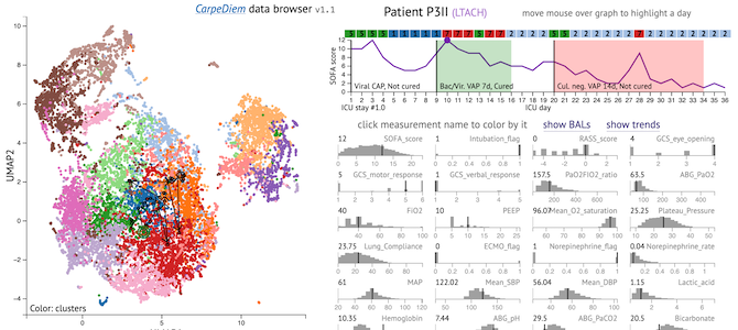
Around 2023, for our Machine learning links unresolving secondary pneumonia to mortality in patients with severe pneumonia, including COVID-19 publication, I have created an interactive visualization of the electronic health record data from our intensive care unit: CarpeDiem data browser. The primary goal of this tool was to allow a global overview of all the data (each day of each patient), with the ability to zoom in on specific measurement, to enable discovery and spot-checking of patterns. This is an open-source tool built with d3.js, source code is available on github.
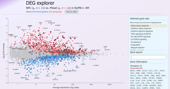
The 2025 severe pneumonia endotypes manuscript has very rich dataset, including EHR data, flow cytometry and scRNA-seq, and many complimentary analytical approaches for this dataset. This scope is beyond a static pdf publication: it would require a very long supplement with a hundred figures. I have built interactive visualizations to explore these data on the companion website. This is also an open-source tool built with d3.js and morpheus.js, and the source code is available on github.
Additionally, I have helped with several interactive visualization projects:
- UCSC Cell Browser, a browser for single-cell data;
- funkyheatmap, a package for flexible visualization of dataframes.
I will be adding more links to this page as I finish more projects, so you might want to check back in a couple of months.
I want to also highlight my inspiration, Bret Victor's work, particularly this project, but if you don't know him, please check out his other projects too.